
Business Logo Design: How To Make More Professional
Table of Contents
Your logo is usually the first thing your customers notice when coming into contact with your company. Find out how colour, font, symbol, and layout selection can help your company logo become more professional.
Creating A Stronger Business Logo Through Smart Design
The logo of any business is usually the first thing that catches people’s attention when they encounter a new company. Even before they become interested in the company’s products or services or visit its website, the logo gives them an idea of what the company stands for.
The wrong design can make even the most trusted company seem unprofessional, whereas the right one can create interest and build trust.
Professional logo creation is not just about selecting pretty colours or adding fancy symbols. It requires an understanding of the company, its audience, and the message it wants to communicate. Each design decision should have a clear purpose and be aligned with the identity of the company.
Regardless of whether a company is creating its logo from scratch or revamping the existing one, the right approach can make a significant difference.
Understand What The Business Wants To Communicate
The primary function of professional business logo design is to convey the essence of its services and distinguish it from others. Designers should study the business values and target audience before selecting the logo colours, fonts, and graphics.
A tech company might prefer a sleeker design, while a brand selling clothes for children could do well using soft colours and friendly shapes. This way, the designer will capture the essence of the business that its customers see.
One place to start would be writing down three characteristics that the company wishes people to associate with their name. This list can then be used to guide any decisions made in the creative process.
Choose A Simple Design That Stays Memorable
A logo shouldn’t have many symbols, various fonts, and complex shapes to catch the customer’s eye. In addition, simple logos are sometimes easier to remember since customers see their design very quickly. An easy-to-understand visual message will make the logo useful for different promotional media.
Logo designers can begin with a single symbol, the appropriate font, and the necessary colours. Removing all extra elements will allow the important design parts to be highlighted without filling up the logo with unneeded clutter.
The best way to check how well a logo is designed is to look at it for a while and then try to recall the basic shape. When it is remembered easily, the logo becomes perfect.
Select Colours That Reflect The Brand Personality
The colours used affect how people feel about the visual identity of the company. The blue colour may be able to establish trust, green may imply growth, and yellow may give the design an energetic look. Nevertheless, the right colour depends on the business and not what is currently in design.
The business needs to choose two or three colours that go together and are in line with the message being sent by the company. Too many colours will make the logo look very complicated, especially when looking at the logo in small formats.
The designers need to consider the colours on both light and dark backgrounds. A good combination of colours will look good regardless of where the logo is displayed.
Connect Printed Marketing With A Consistent Visual Identity
There are ways that can enhance the visual representation of a brand through the use of the same visual appearance across all promotional materials.
Using the same colours, fonts, and logo position enables consumers to relate different marketing materials to one organisation. This becomes even more beneficial in leaflet flyer design for the promotion of products, services, or offers.
With a similar design, all the printed items will have an organised look and feel. At the same time, it will help the company convey its message clearly without confusing the customers.
Pick Typography That Makes The Business Look Reliable
The typeface of a logo will affect how the customers perceive the brand. While a professional typeface would be ideal for the logo of a finance or law firm, a friendly and rounded typeface would look better for a creative firm. The lettering should enhance the personality of the brand but without damaging its name.
Avoid using multiple fonts within one logo. In most cases, one good font is enough, although in some cases, two fonts may work well if the logo requires a bit of personality.
The company’s name should be legible regardless of its size. The logo should not only look good on the computer screen, but it should also be legible on the mobile phone screen.
Create A Distinct Symbol That Customers Remember
A meaningful symbol will enable customers to identify a company without having to read the whole name. But picking a familiar symbol without coming up with something new may cause the logo to resemble other competing logos. The symbol has to relate to the corporate identity in some way, but at the same time be recognisable.
For example, a bakery can pick a simple symbol of wheat, but the design of the symbol must have something unique that is related to the corporate name. A property company can also opt for an abstract symbol of a building rather than a familiar symbol of a house.
The designers need to try out various sketches prior to selecting the symbol. This will give them a chance to get a visual representation that is unique and relevant to their audience.
Use Professional Design Tools For Better Results
The right tools will aid in making the design process easier in achieving a great visual identity from a rough concept.
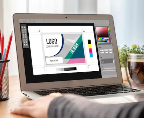
Programs like Adobe Illustrator and CorelDRAW allow the designer to have much more control over the design aspects, including the shape, spacing, colours, and typography used. The two programs use vector graphics, which keep the quality of the images the same when resized.
Free tools may help to generate initial ideas and basic design options, but there is greater flexibility when creating professional logos with professional software. The designer can modify particular elements, make different variations, and prepare files for digital and printed applications.
Nevertheless, even though the designer works with professional software, the outcome will not necessarily be successful. The quality of the outcome depends on the creativity, planning, and knowledge of the company’s requirements.
Make Every Customer Interaction Look Professional
The printed material serves as the first introduction to customers who have not yet visited the website of the business or contacted the business personnel.
Good-quality business cards make it easy for others to remember the company name and contact numbers.
High-quality business card printing helps a business convey the image of the business logo, colours, company name, and other contact details. The choice of quality paper and design enhances the image of the business card.
Matching the image of the company on the business cards gives a good impression to customers, who will find the business to be organised and professional.
Test The Logo Design Before Finalising It
A design might seem very good to a designer when seen on their screen, but it would convey a different message when it is seen by other people. Testing enables companies to know whether their logo conveys the right message and resonates well with the target audience.
The company can show up to two or three designs to some potential clients. Instead of asking what design seems prettier, it needs to ask which one seems more appropriate, credible, and memorable.
The logo should also be tested on the website header, business card, social media profile, and print materials. This will detect any problems that are not visible in the original design file.
Frequently Asked Questions
What characteristics make an effective logo professional-looking?
There should be a good layout of the logo, appropriate typographical elements, relevant colours, and some meaningful imagery elements within. Most importantly, the logo should be consistent in all areas of representation for the company. This includes websites, printed materials, packaging, and social networking sites.
How many colours should there be in a professional logo?
The best number of colours to consider is usually two to three, as this will create harmony in the logo design and avoid overloading it. The business should select colours that suit its image and stay recognisable in various background settings.
Does a logo need to have a company name?
If the logo contains a company name, it can help a new business gain popularity and establish itself. Yet a well-known company can still have an individual symbol that would complement its visual identity. Whether to do so or not is a matter of recognition and target audience.
Which software is better for making a logo?
Adobe Illustrator and CorelDRAW are the most commonly used programs to create professional logos since they use vector graphics. Moreover, Canva can help beginners create basic designs. It all depends on the design abilities and preferences of the individual.
When should a business change its logo?
Changing a business’s logo is not a daily practice and is not necessary. It can be changed if the design looks outdated, no longer describes the company’s services, or cannot be applied successfully on new platforms.
Conclusion
A professional logo creates a unique identity for the business. The colour scheme, font, and symbols used in the logo should convey the business’s message in a way that appeals to the target audience.
Simple, innovative, readable, and consistent are some key features of a successful design. Also, testing various options and ensuring that they appear correctly both on the digital platform and in print will help to avoid errors. The logo needs to be as clear on a small screen as it is on a large board. A good logo should not only be an attractive image. It should also speak about the business, establish credibility, and help people recognise the brand. Proper planning will ensure a unique business identity.

I am a seasoned designer and content creator for Logo Design Ireland Blog, where I combine design expertise with actionable advice for business owners. My articles cover everything from logo trends and branding psychology to practical design tips that help Irish entrepreneurs elevate their brand identity.