
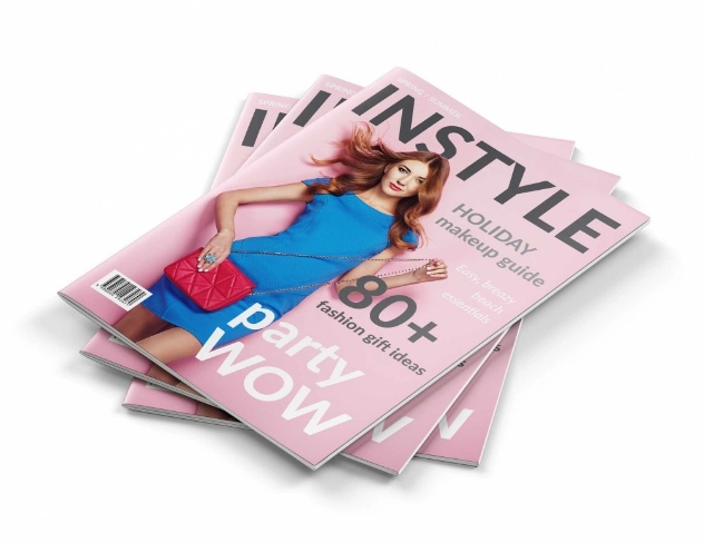
How Magazine Cover Design Grabs Attention
Table of Contents
Despite having a great story, eye-catching photos, and great content in your magazine, people will just ignore them because they do not catch their interest. This can be very frustrating considering the fact that you have done everything to create something that is worth reading. However, getting someone’s attention is not always easy, and it starts even before opening the magazine.
An untidy design, boring colours, or lack of captivating headlines can easily make your magazine unnoticeable. On the positive side, some simple things can make your magazine noticeable. Let’s explore what makes a magazine cover impossible to ignore.
How Does a Magazine Cover Make an Impact?
The magazine cover creates impact if the target audience recognises the theme of the magazine, the dominant part on the cover and their curiosity about the contents of the magazine. One must bear in mind the fact that it is crucial for the cover to tell about the magazine’s essence without giving too much information.
Consider two magazines lying side by side. The first one has a couple of competing headlines, several different colours, and a busy photograph. The second one has a captivating photo, a strong headline, and three cover lines. Even though both magazines have similar content, the second cover might attract more attention.
The following three things make up that distinction:
- A focus point: Offer your readers something to start with, a portrait, a headline, an illustration, etc.
- A proper message: Make sure that your cover includes the topics that your reader will be interested in from your magazine.
- Unique identity: Create a unique visual identity of your magazine, differentiating it from all other magazines available.
While a business magazine could benefit from having a simple design, a music magazine could employ vivid photography and bright colours. Both approaches cannot be judged in terms of being better or worse. It is all about relevance to your audience.
How Does Visual Hierarchy Guide the Reader’s Eye?
It is the order in which different elements in a design become visible to the reader. It enables you to guide the reader’s attention towards the magazine name, the main picture, and other elements without confusing him/her about where to look.
What elements do readers need to see first?
Identify what the most important thing in your design is. The most important element should be emphasised most, followed by the name of the magazine.
You can establish this order through:
- Size: The size of the main title should be larger than that of the supporting titles.
- Placement: Important elements should be placed in a position to attract attention.
- Contrast: Differentiation should be created between important information using colours, boldness and highlighting.
- Proximity: Proper spacing should be provided for important elements so that they do not compete with other texts.
Take the case of a travel magazine that contains an image of a mountain village. When the picture dominates most of the cover with just one headline, you will be able to easily tell what the story is all about. However, putting six equally dominant headlines on the same cover would defeat the purpose.
One way to judge whether the hierarchy is effective is to look at the cover for a while and then turn away from it. What stands out in your memory? If the main story is difficult to identify, the hierarchy may need improvement.
Which fonts work best on a magazine cover?
For the magazine cover design, there can be different fonts used for its title, headline, and smaller text; however, it is important to know the purpose behind choosing those specific fonts. It is not appropriate to have too many random fonts, because it will cause inconsistency within the cover design.
The main headline might require a bold display font, whereas other stories require a font which is easier to read. The magazine’s title requires its own font, which should be consistent throughout all the issues.
How Does Cover Image Affect the Reader’s Choice?
In most cases, the main cover image serves as an indication of what the theme of the magazine is. If the right cover image is chosen, it will intrigue the reader, express some emotions, and even help readers visualise the content of the magazine without having read anything yet.
A cover image of a fashion magazine should reflect elegance and grace, while a wildlife magazine cover image should represent a certain animal.
What should you look for in a cover image?
Images that adhere to these criteria:
- Relevance: An image that is relevant to the topic featured or the overall theme of the publication.
- Quality: High-quality images that are of a good resolution as per the print size required.
- Composition: There should be enough space on the cover reserved for the printing of the name of the magazine and the cover lines.
- Originality: Be sure to find something unique that will help you make your cover stand out among other magazines.
In particular, a face might become an especially good option for a cover if the facial expression is in line with the message of the headline. But a striking landscape, object, or illustration might also work just as well if it is appropriate for the topic.
It should be noted that the research also provides interesting evidence. In a 2024 study of online and PDF magazines, researchers used the assistance of AI to study the eye movements of readers. The results of the study showed that readers focused on faces and images located in the top portion of the magazine and on the text related to these visuals.
How Does Branding Make a Magazine Recognisable?
The reader must be able to identify the magazine without having to read its entire name. Visual identity will make sure that the magazine is consistent issue after issue and also differentiates itself from other magazines in that field.
Elements of brand include the name of the magazine, logo, fonts, colour, photography and design. One can even change the cover but maintain some consistency.
Where does the logo fit into the design?
Normally, the title of the magazine is one of the most important elements in the design of its cover. For the logo to be recognisable, it has to be unique, distinctive, and consistent. Custom logo design will help you differentiate your magazine from others, especially when you have to use your magazine name not only for the cover but also for the website and social media headers.
Remember the following tips:
- Make the magazine title easily recognisable at first sight.
- Choose the logo type that corresponds to the character of the publication.
- Always stick to the same proportions and spaces between letters.
- Don’t use any important details of the logo on top of complicated visual backgrounds.
- Be sure that the title is still recognisable in small web versions of images.
For instance, the business magazine logo will consist of the plain wordmark, whereas the arts magazine will have an expressive title. Everything depends on the successful brand identity.
Can Layout and Presentation Make a Cover More Effective?
Yes. Good layout makes it easier for readers to comprehend the cover without being confused by it. Even if there are attractive visuals and good headlines, they cannot have any effect if they are crammed into a small area without a proper arrangement.
Here comes into play the knowledge gained during the course of presentation design. While magazines and presentations may seem to be different in purpose, they need the same things – visual hierarchy, readable text, spacing, and message clarity.
How should one organise the elements?
The starting point will be the visual and headline, and other elements will follow around them.
A practical layout should include:
- One clear focal point.
- A prominent magazine title.
- A main headline that explains the central story.
- Some supporting headlines for additional arguments to convince people why they should be reading the book.
- Proper white space to avoid a cluttered cover design.
Just because you have white space doesn’t mean you’re wasting it. White space is actually there to give some breathing space to the reader’s eye and highlight essential information. One of the best ways to check whether your hierarchy works well is to scale down your cover so that it appears in the form of a thumbnail of a website. When your image and headline are still comprehensible, then the hierarchy works great. Otherwise, you need to simplify your design.
Readers Usually Ask
What makes an attractive magazine cover design?
A well-defined focus point, relevant visuals, legible font types, colour balance, and arrangement are some of the features of an attractive cover. The design must also be related to the theme and target market.
How many headlines should there be on the magazine cover?
There is no definite number. Just include the main headline and other story headlines that complement each other with the aim of providing valuable content for the reader.
Why is typography necessary when designing magazines?
Typography creates the personality of the magazine and helps readers locate the significant areas of the magazine. Typography is essential since it helps with scanning.
Is it good if the digital magazine cover is different from the print cover?
The core identity of the magazine can be maintained, but the cover layout should be adjusted depending on the smaller screen.
To Conclude!
An eye-catching cover of a magazine makes people stop for a second before moving on. Through the combination of appropriate imagery, legible typography, thoughtful colour choice, good hierarchy, and proper branding, it will convey all the value of the magazine in just a split second. It’s not necessary to fill every space available but rather to think about what your target audience really needs. Test your concept in various sizes and improve if necessary.

I am a seasoned designer and content creator for Logo Design Ireland Blog, where I combine design expertise with actionable advice for business owners. My articles cover everything from logo trends and branding psychology to practical design tips that help Irish entrepreneurs elevate their brand identity.