

Presentation Design Best Practices For Effective Slides
Table of Contents
Looking to make presentations that will grab people’s attention? Learn about slide design tips, pitfalls to avoid, and easy ways to structure your presentation, increase its readability, and convey a message that will stick with your audience.
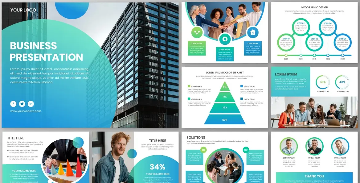
Mastering Modern Presentation Designs For Visual Storytelling
Engaging your target audience when conducting significant business presentations requires clear and attractive slides that make sense, rather than distracting them.
With the combination of good visuals and concise messaging, essential ideas will become obvious and impressive in important sales presentations within any corporation.
Properly structured slides will keep everybody interested and focused only on your essential message at all times.
Following proper design guidelines helps you ensure that your message is memorable and convincing during any important meeting room presentation.
Understanding the fundamentals of visual alignment techniques enables your team to create presentations that will always impress executive decision-makers.
Capture Immediate Attention With Clean Opening Layouts
Having an uncluttered presentation design makes you instantly credible and creates interest among meeting attendees from the get-go. Title designs provide your target audience with a nice visual gateway to your presentation that immediately excites them.
Avoiding any unnecessary graphics in the beginning makes sure that people are able to pay full attention to the message you are trying to convey. Title designs help create a polished environment that inspires the entire discussion ahead.
Putting some negative space around your opening slide makes sure that your presentation topics stand out visually. It will help your executives understand the purpose of your session and get excited about your proposals.
Structure Core Information Using Direct Visual Hierarchy
Prioritising elements by importance allows team members to manage complex technical information without being completely swamped. The primary messages should always grab the viewer’s eye before any of the supplementary messages get the viewer’s attention.
Using different font sizes, line weights, and arrangement in presenting visual designs creates a natural flow for viewing on screens. Clear layouts will help busy executives understand key performance numbers in just seconds when reviewing their reports.
Alignment of the layout keeps the flow smooth as readers go from one page to another. This structuring process turns complicated analysis into easily digestible graphic stories that instil confidence among the executives.
Strengthen Audience Connection With Purposeful Imagery Selection
Using real and relevant photos is effective for emotional impact while emphasising critical strategic messages in all business pitch decks. Visual elements help convey the central ideas behind the story in a relevant way to ensure that the message is clear for the audience.
High-quality graphics improve the production quality of the presentation and provide it with a professional look appreciated by buyers. Using non-generic stock photos will make your company’s story more believable, relatable, and highly credible to the new partners.
The right graphic choice will be helpful in emphasising verbal explanations and creating memorable visual cues that will stick with your audience even after the successful meeting is over.
Balance Slide Composition Using Strategic Whitespace
Utilising large amounts of open space around the text boxes and graphics ensures that there is no visual clutter and ensures good readability of slides.
Open space acts as an invisible frame, enabling key metrics to be highlighted effectively without being overwhelmed by the background.
Creating enough breathing room for visuals allows you to create an organised presentation screen that will ensure the attention of the audience during long presentations. Spatial organisation avoids cognitive overload and ensures that business proposals are easily understood.
Balance in composition makes it possible for the most important numbers and key highlights to be emphasised, ensuring that your main message is easily understandable.
Guide Viewer Eye Flow With Dynamic Colour Contrast
Application of high contrast in colour selection ensures that the important information is emphasised in the process, ensuring good readability from any part of the room.
Proper use of colours helps in categorising important information in a natural manner so that it becomes easier for you to find important trends and priorities.
Limiting the number of main background colours avoids strain on the eyes, making it easier for viewers to watch presentations.
Proper application of colour helps you build a strong brand identity and also directs the eyes towards your sales targets. The harmonising shades make sure that your callouts stand out on the screen.
Highlight Core Metrics With Strategic Focal Points
Putting important revenue numbers and growth statistics in big display boxes ensures that your presentation will grab people’s attention at all meetings.
Important focal points highlight crucial quantitative success points, making sure that your important business wins do not go unnoticed on every slide layout.
Encircling your important metrics with background shapes makes sure that there is a clear boundary between your important numbers and regular body text. Visual framing of your important metrics helps to highlight your important business successes.
Combining custom brochure design with your slide decks helps to highlight important performance metrics in print handouts. Proper visual highlighting helps to direct the executives’ attention to your important financial strengths.
Simplify Data Representation Using Modern Chart Layouts
Turning the numbers into graphs helps make the process easier for understanding performance trends for decision-making.
Removing excess elements in graphical data presentation ensures that important numbers concerning revenues are the sole focus of such a graphical format.
Use of clear labels placed adjacent to data helps avoid any difficulty in searching for legends, making the process of understanding very quick during executive briefings.
Strategic visual aids promote fruitful conversations by identifying growth strategies through graphical displays without any visual distractions on the screen. Good visual representation of data helps leadership make effective business decisions.
Focus Audience Attention By Minimising Text Volume
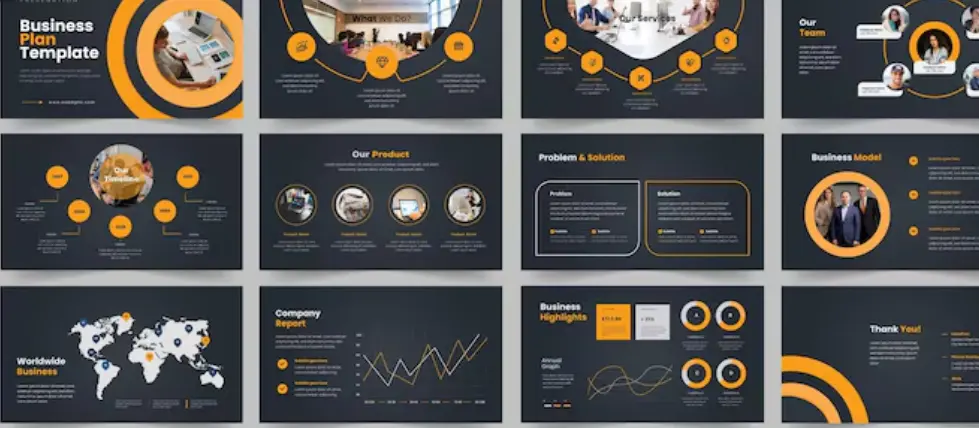
Using bullet points instead of long paragraphs of text will ensure that the attention of the audience stays fixed on the speaker rather than on the text-heavy slides.
The short written phrases will allow you to elaborate verbally without having to repeat what is written on the slide.
Controlling the number of words per slide will ensure that the important points are made in a powerful way that will leave a lasting impression on your prospective business partners.
Short messages will prevent information overload and make it easier for the viewer to process the most important value propositions quickly during the sales call.
Pace Slide Content To Support Natural Delivery
Distributing topics with complex narratives evenly through several simple slides avoids overcrowding and helps retain consistent momentum throughout the presentation.
Single-idea slides allow for discussion of a particular strategy in a focused way before moving on to another organisational aspect.
Balancing the visual pace will provide enough time for your audience to understand everything without any rush or overloading. Even distribution of information guarantees that all the strategic points get equal attention.
Pacing slide transitions in a natural way allows for verbal delivery and helps the speaker retain a commanding tone in every meeting. Narrative flow keeps the listeners engaged, which ultimately leads to an effective conclusion.
Unify Visual Elements To Refine Overall Brand Loyalty
Corporate graphic standards will help ensure consistent corporate identity and will also help your clients recognise the brand effortlessly. Consistent visual identity will showcase the professionalism of your corporate culture and the attention to detail from your team.
Use of consistent corporate colours, icons, and logos creates a great visual package for all external communications. Incorporating the clean company logo design in the header of each slide master helps to tie all presentations to the overall corporate identity.
Branding all presentation slides harmoniously creates high levels of trust in the market and makes your organisation the recognised leader in its industry. Visual identity turns ordinary business proposals into memorable brands that secure valuable contracts.
Frequently Asked Questions
How many slides should be used in a standard business presentation?
Ten to fifteen slides are used in a standard business presentation for a thirty-minute meeting. Such a number gives enough space to elaborate on the key strategic points without rushing through and gives enough time for questions, discussions, and decision-making.
What is the optimal size of the font in the body of the slide?
The optimal size of the font in the body of the slide is between eighteen and twenty-four points. It guarantees good visibility from the back of the conference room without forcing the presenter to clutter the slides with numerous lines of text.
How can complex financial data be made more readable on the slide?
Complex financial data can be made more readable by converting it to simple bar charts and line graphs with a few grid lines. The key figures should be highlighted in contrasting callout boxes so that stakeholders understand the financial trends within seconds.
Why is negative space important in the creation of executive slides?
Negative space is important because it helps in avoiding clutter and making the core components of messaging clear. Enough space around text and images helps reduce cognitive overload, allowing busy executives to take in all necessary information quickly.
Can animations be used when making a corporate sales pitch?
Animations can be used sparingly to reveal bullet points one at a time. However, complex or distracting visual transitions should not be used in such presentations since they distract viewers.
Conclusion
The application of effective slides allows business people to easily communicate technical ideas through a visual message.
Creating enough negative space, using visual hierarchy, typography, and colour contrast ensures an impressive and polished presentation that will capture executives’ attention without effort.
Condensing the written text, pacing the message logically, and creating good data visualisations ensures engagement of your target audience throughout the entire meeting. Using a unified master template keeps the integrity of your brand intact by setting a presentation standard for executives. Modern design techniques make it easy to create appealing designs for proposals that can bring commercial success.

I am a seasoned designer and content creator for Logo Design Ireland Blog, where I combine design expertise with actionable advice for business owners. My articles cover everything from logo trends and branding psychology to practical design tips that help Irish entrepreneurs elevate their brand identity.