
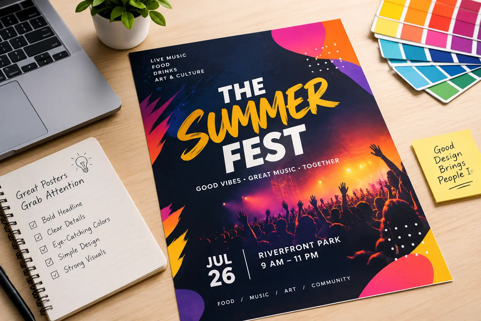
Event Poster Design: Tips to Capture Attention
Table of Contents
Posters still earn their place next to social media. A poster in a shop window, on a college noticeboard or in a community hall reaches people who are already nearby. A social post gets scrolled past within a few hours, but a poster is usually put up and left for the length of the campaign. The same people walk past it again and again.
Poster design decides whether they stop to read it or carry on walking. This guide takes you through it in the order you would work on it, one step at a time.
What Makes an Event Poster Work
An event poster has one narrow job. It tells a passer-by what the event is, when it is and where, and gives them one way to find out more. Poster design is mostly the work of making that readable in passing.
That means a poster is read at walking distance, not arm’s length. A club fundraiser notice on a community hall door, a gig poster in a pub window and a society night on a college noticeboard all get a quick look from the path. If the name and date can’t be read from there, nothing else on it will be.
A poster is also not a flyer or a programme. The full line-up, ticket terms and directions belong on a website or social page. The poster only needs to point there with a link or a QR code.
Deciding what goes on the poster and what waits for that page is the main skill in good poster design.
1. Decide What the Poster Must Say
Start with who the poster is for. A student society night and a club fundraiser reach different people, so the wording changes with each. Then pick the one thing you want them to remember. For a charity quiz night, that is the quiz itself, not the cause behind it or the list of prizes.
Every event poster needs five details:
- Event name
- Date
- Time
- Venue
- How to book or attend
Everything else can wait for your website or social page. Parking, the full line-up and long descriptions only crowd the poster and push the main details out of view.
Last, decide whether the poster will be printed, shared online or both. A tall print poster and a square social post need different layouts, so it helps to know before you start.
2. Put the Event Name First
Once the details are chosen, the next job is order. People take in a poster from biggest to smallest, so the size of each item should match how much it matters.
| Level | What goes here | Size |
| Headline | Event name | Largest |
| Details | Date, time, venue | Medium |
| Action | Ticket link, QR code or website | Smaller |
The action line often sits near the bottom, but its position matters less than keeping it smaller than the details.
Write the details the way people say them. “Sat 14 March, 8pm” is quicker to read than a full date with the year and a 24-hour time. If the event is ticketed, put the price in euro beside the booking link or QR code.
Magazine cover design follows the same order. The title sits large at the top, one cover line gets the most space and the rest stay small. A reader knows where to look first without being told, and a poster needs that same clarity.
If the poster runs in English and Irish, keep the same order for both and make one language clearly larger so the headline does not split in two.
3. Short Text Is Easier to Read
Readability comes down to giving the eye less to do. Three things help most.
- Fonts
Two typefaces are enough:
- A bold one for the event name
- A plain one for the date, venue and details
A third is fine for a small tagline. More than that makes the poster look busy before anyone has read a word.
- Contrast
Text has to stand apart from whatever sits behind it. Dark on light and light on dark both work. Light text over a busy photo is where posters often struggle. A darkened layer over the image fixes it and the photo stays visible.
- White Space
Empty space around the date and venue is what makes them easy to find. Removing a line of text often helps more than making the date bigger.
Before printing, stand a few metres back from the screen or a printed copy. If the date is hard to read from there, make it bigger.
4. Use One Strong Image and a Simple Palette
Take a trad session poster for a Friday night in a pub. One close photo of a fiddle player, cropped so the hands and the instrument fill the frame, is enough. A second photo of the pub or the full band would only pull the eye away from the event name.
Colour works the same way. Choose one main colour and a second to contrast with it, and let them suit the mood of the event. Colour associations are a guide and not a rule. Three events show how different the looks can be:
- Trad session: warm, earthy tones and a hand-drawn feel
- Charity run: bright, lively colours and an action photo
- Student ball: a dark background with one bold or metallic accent
If the full details aren’t confirmed yet, a teaser poster can carry the event name and date only with an image that hints at the mood. You can follow it with the full poster once everything is settled.
5. Add Logos and Sponsors Without Making it Look Cluttered
Take a charity 5k poster with four local sponsors. The poster looks crowded and the event name loses space if each logo sits in a different corner. A single row along the bottom keeps the top space clear for the headline.
Ask each sponsor for their logo as a vector file or a large PNG. A logo saved from a website usually looks fuzzy in print. Ask for a white or one-colour version as well, for use on dark backgrounds.
The same goes for your own logo. A custom logo design that stays readable when it is small, and works in one colour, can go on posters, programmes and banners without being redone each time. An event does not need a new logo, though. If the current one is clear at a small size, keep it.
6. Poster Size Depends on the Location
Take a gig at a community hall with about forty posters going up across town. Where each one ends up decides how it should be made.
- Printed Posters
- A3 suits a shop window or noticeboard, where people stand fairly close. A larger size works for a spot people see from the road.
- Ask the printer for a print-ready PDF with bleed, so trimming never cuts into the design.
- Keep the date and venue away from the edges.
- Social Posts
Crop the poster to the shape of the platform instead of shrinking the print version. Then open it on a phone and check that the date can be read without zooming in.
- Time and Permission
Order the prints early enough to cover printing and putting them up. Ask the venue, the shop or the local council before using poles and walls, as rules differ between areas.
A Quick Test Catches Problems Before Printing
Show the draft to someone who has not heard about the event, such as a flatmate or a colleague. Give them a few seconds, then take it away and ask three things:
- What is the event?
- When is it?
- Where is it?
If they hesitate on any of them, that detail is too small or in the wrong place.
Then print one copy and put it where the poster will hang. A window with glare or a dim hall noticeboard can make a clear design hard to read, and you only notice that in the real spot.
If the poster has a QR code, scan it with a phone before printing a full run. A link used only on posters also shows how many bookings came from them. If you try two versions, change one thing between them, such as the image, so you know which change made the difference.
When to Hire a Designer
A simple template and the steps above are usually enough for a one-off event on a small budget. A school fundraiser or a single club quiz night does not need outside help.
It starts to make sense when posters keep coming. A student society running a night every month or a festival committee fitting six sponsors onto every poster, ends up rebuilding the same layout each time. A designer sets it up once so every later poster matches. A poster design service should also supply print-ready files and social sizes cut to fit, so you are not resizing the night before.
To get a useful first draft, send the designer:
- The five event details
- The venue and the audience
- Your logo and any sponsor logos
- The print and social sizes you need
- The date the posters must be up by
FAQs
1- How early should I put up event posters?
Two to three weeks before the event is a good guide for most local events. A gig or fundraiser with ticket sales is worth the full three weeks. A one-night society event can go up about a week to ten days ahead. Check them once midway, because posters get taken down or fall off.
2- Do I need permission to put up posters in Ireland?
For shop windows, noticeboards and private walls, you need the owner’s consent. Poles, road signs and other street fittings are often off limits, so ask your local council before using them. Councils such as Cork City and South Dublin also expect event posters to come down within seven days of the event.
3- What file should I send to the printer?
A print-ready PDF is the usual choice. Ask your printer whether they want CMYK colour and a bleed, which is often 3mm. Photos should be sharp at the final size, and 300 DPI is the safe choice for smaller posters. Large posters read from a distance can go lower. Embed or outline the fonts so the text does not shift.
4- What is the difference between a poster and a flyer?
A poster is put up in one place and read from a few steps away, so it carries the event name, date and venue. A flyer is handed out and read up close, so it has room for the full programme, ticket details or a map. The poster draws people in and the flyer holds the extra detail.
5- Can I make an event poster from a free template?
For a one-off event, yes. Replace the placeholder text, image and colours with your own and add your logo. Before printing, check that the tool can export a print-ready PDF at the size you need. A screenshot or a social media export will look soft on paper.
Let’s Wrap It Up
A poster rarely needs to say much. It has done its job if someone can read the event name, find the date and know where to go. The real work happens before any colour or image is chosen, when you decide what goes first and what stays off.
Start your next poster as a rough sketch on paper. Hold it a few steps back and see what your eye reads first. If posters are becoming a regular part of your events, a designer can take that work on and keep every one consistent.

I am a seasoned designer and content creator for Logo Design Ireland Blog, where I combine design expertise with actionable advice for business owners. My articles cover everything from logo trends and branding psychology to practical design tips that help Irish entrepreneurs elevate their brand identity.