

How a Professional Book Cover Can Increase Sales and Build Trust
Table of Contents
A book cover acts as an indispensable sales tool before it is anything else. Whether scrolling online or browsing physical shelves, readers make definitive purchase decisions in under two seconds.
This quick evaluation is based solely on the visual information in a thumbnail grid and occurs well before a word’s description is read. That is the immense weight a cover carries, and why professional execution matters more than most authors budget for.
In the end, the choice of design is a bottom-line business decision that can impact an author’s market visibility, long-term brand equity, perceived credibility, and result in a crowded market.
What Readers Decide Before They Read a Word

When you are in the bookstore or on Amazon, you are relying on pattern recognition to determine what books you want to purchase. Readers don’t critically analyze every book cover; they are looking for cues that are similar to what they think of as a good cover in that genre.
A thriller reader sees a dark contrast, bold sans-serif type and no imagery and immediately knows it is a thriller. Self-help readers are looking for a clean layout and an uncluttered palette. If a cover is similar to these signals, it earns attention. When it doesn’t, it disappears regardless of what’s inside.
Much like the design company logo, this is the first thing a professional cover has to be: easy to read in the visual vocabulary of its genre.
What Separates a Professional Book Cover From a DIY One
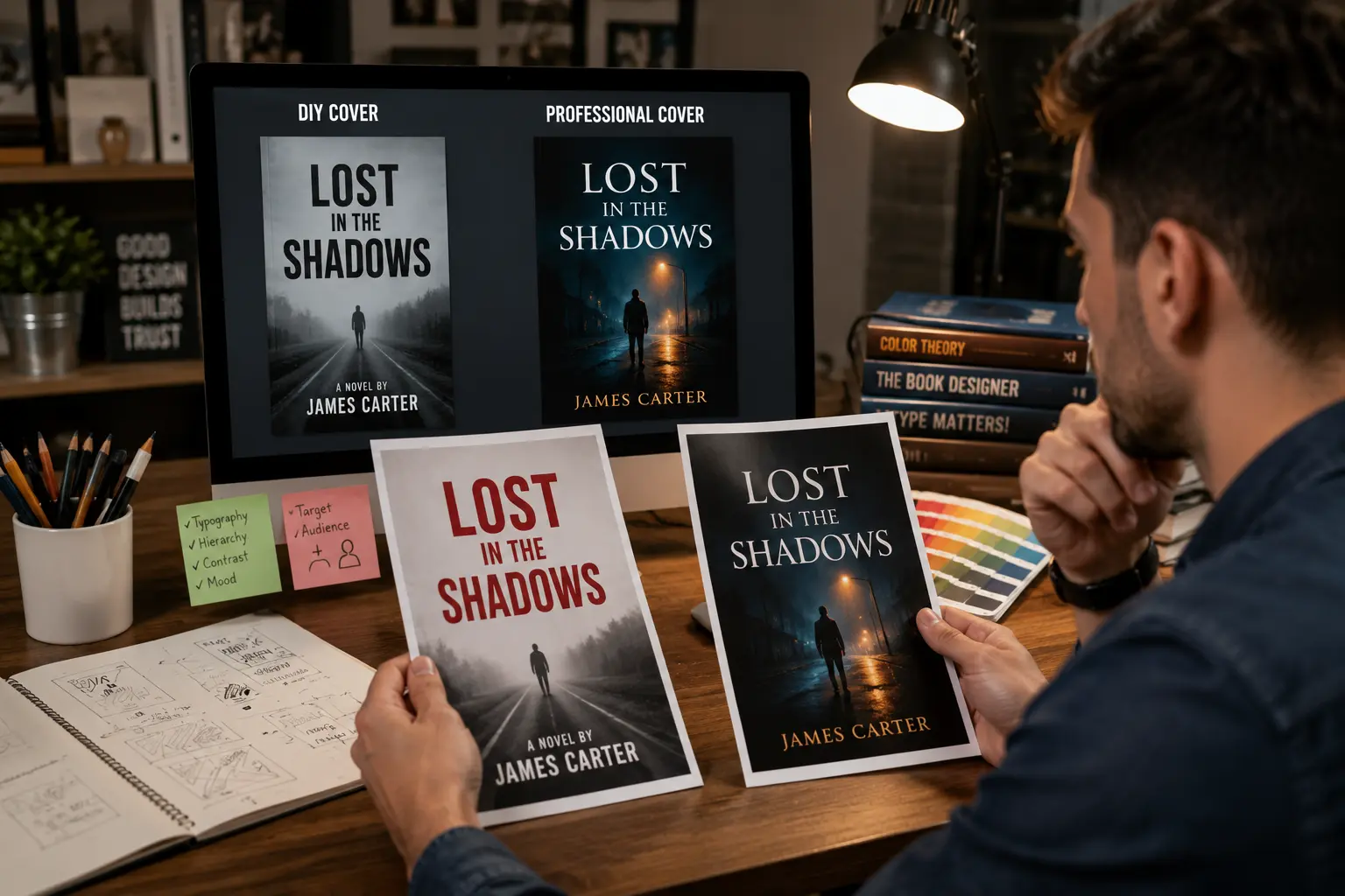
- Thumbnail Performance vs Full Size
The gap between a professionally designed cover and a self-made one isn’t always obvious at full size. It’s quite evident as a thumbnail.
As Amazon’s search result size gets smaller (around 160 pixels wide), a self-made cover becomes impossible to read, the details are lost and there are problems with contrast. Professional designers know how to set up the type from the beginning to be readable in a thumbnail, varying the weight and spacing to suit and selecting colors that look strong at smaller sizes.
- Type Hierarchy And The Quality Of Graphics
A professional cover is a cover with two or three typefaces that are used with intentional weight contrast, scale, and spacing. Too many font styles and/or sizes are often used in self-made covers. These little choices all add up to whether or not a reader will invest their time in a book or not.
How Book Cover Design Affects Perceived Credibility

Book Cover design is for more than just catching eyes; this design can help evaluate a book before the reader turns even a single page. If the cover is poorly designed, it will have an association with poor internal quality even if that’s not true. It makes sense that if the author didn’t spend a lot on the cover, they didn’t spend a lot on the editing or content.
That’s what professional book cover design does. This signal is commercially relevant, particularly for non-fiction titles where the author’s credibility is a key part of the value proposition.
The Branding Dimension: A Cover as Part of a Larger Visual Identity
- Series Coherence and Asset Equity
For authors building a body of work, each cover is part of a visual system, not a standalone artifact. Make sure that every series is coherent and has equal value. Each cover in the series is not isolated; they are connected as part of a visual system for “builders” of a body of work.
Color, typography, and design elements must be consistent and visually coherent across a series to ensure the reader knows these books are related. If it’s done right, it’ll carry the recognition equity forward: If the reader who purchased book one recognizes book two in the thumbnail without bothering to read the book’s title, book two has gained recognition equity from book one.
- Corporate Logic & Brand Identity
This is the same as the process of building brands. A good company logo design conveys a particular message and uniformity each and every time it’s seen. The same concept goes for covers, which reinforce the author’s brand, rather than re-start the recognition process.
Genre Conventions Versus Standing Out: Getting the Balance Right
There’s a tension every author and designer navigates: following genre conventions closely enough to be recognizable. While doing something distinctive enough to be memorable.
Covers that are too conventional just blend in. People who don’t read the entire cover will be lost. The successful middle ground signals the right genre while doing one or two things differently: a distinctive color combination, an unusual typographic choice that still reads as appropriate, or an image treatment that feels fresh without being unfamiliar.
It takes a lot of knowledge of the genre conventions to get the balance right, and then to break them. Book cover design makers who specialize in book covers learn what’s working in a particular genre, but not to steal it; they learn how to recognize the attributes that are carrying the book, and how to reinterpret them.
What the Data Says About Covers and Sales
The relationship between cover quality and sales isn’t speculative. Publishers have tracked it for decades, and self-publishing data has made it more granular. Those authors who have had professional covers after going through the “Do It Yourself” process have consistently found their sales to be boosted by the cover itself, but not because of any changes in the content.
When it comes to traditionally published books, cover redesigns for backlist books are a common occurrence that brings in sales. If a book fails to sell, and the cover is poor, it gets a new cover and a return to the bestseller list, the content being the same.
FAQs
- What is the average price of a professionally made cover?
There is a variation in rates depending upon the experience of the designer. The cost of an Indie book cover designer is $200 to $600. Mid-level designers who have published experience will charge $600 to $1,500. If you’re on a budget, you can purchase pre-made covers for as low as $50.
- Is it as important to have a cover for ebooks as for print?
Arguably more. The thumbnail image is frequently the first visual element that comes into potential buyers’ eyes before making a buying decision. While print covers have size and texture to play to their advantage, ebook covers must convey everything through scale and visual impact at a small size.
- Should authors have input on their book cover design?
Yes, but within boundaries. The author contextualizes the genre, tone and key thematic details. The designer makes decisions about what it looks like. When authors step outside their design sensibilities and try to use their own tastes, they often end up with a cover that isn’t on target.
Conclusion
A professional book cover does three things: it gets people to recognize your book as its genre. It establishes credibility, and it turns headliners into book buyers.
It is the most commercially significant design expenditure a book project can make. And one that is most commonly overlooked by any author. Who takes the next step toward getting his or her work into the hands of readers. Often, writers invest years in writing. Only to fail to launch their project with simple packaging. Authors are able to make their work judged according to its words. And not just dismissed at a glance by giving utmost preference to the design. Visual marketing turns a simple digital thumbnail into a powerful, irresistible thumbs-up call to action. That readers don’t have time to pass up.

I am a seasoned designer and content creator for Logo Design Ireland Blog, where I combine design expertise with actionable advice for business owners. My articles cover everything from logo trends and branding psychology to practical design tips that help Irish entrepreneurs elevate their brand identity.