
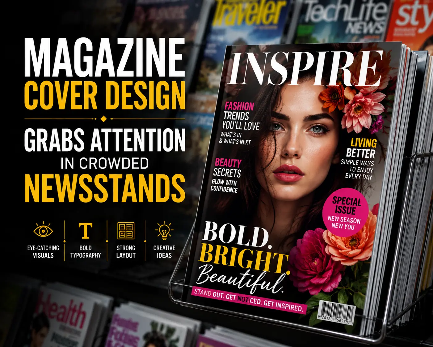
How Magazine Cover Design Grabs Attention In Crowded Newsstands
Table of Contents
A crowded newsstand is just a visual competition for the magazines, where each publication has a chance of just a few moments to earn a second glance. Making an eye-catching cover design that can grab attention in a crowd is not about choosing attractive graphics, but about understanding human behavior, smart branding, and visual psychology.
It is not an easy task to create the strongest covers. Great covers are the combination of color, typography, imagery, and storytelling in different ways that immediately connect with readers. This blog is a guide that helps you to explore the design choices that can make an engaging magazine cover and why these details can have a great impact on sales and reader engagement.
Why Magazine Cover Design Grabs Attention In Crowded Newsstands
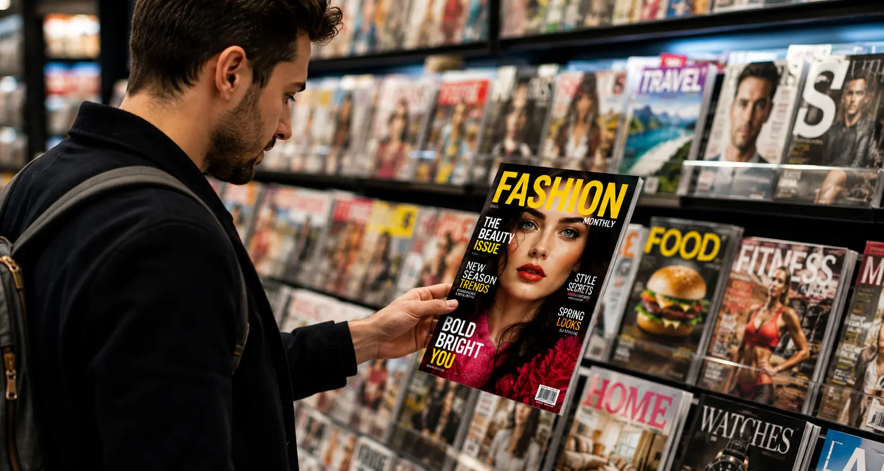
It does not only need bold colors to stand out among dozens of competing titles. Each element of the design needs to work together to guide the eyes of the readers naturally and communicate value within seconds.
1. First Impressions Matter
Some research shows the audience often makes visual judgments and scans the cover in predictable patterns that start with the masthead before looking at the main image and headline. Most experts say that a magazine has roughly three seconds to capture the audience’s interest, which makes each design decision count.
2. The Power Of Visual Hierarchy
A successful cover design leads the eye, not overwhelm it. Expert designers carefully control the image placement, headlines, and supporting text so readers can immediately understand the biggest story of the magazine without searching.
3. Color Psychology
If you will use bright colors, it might attract attention, but a contrast can create clarity. A limited palette can work better than choosing each available color because the readers can instantly identify the focal point, not process visual clutter. Recent studies show that colors are the elements that viewers significantly focus on first.
4. Typography Creates Personality
Fonts are the way to communicate a tone before a person reads a single word. Fashion magazines often feature elegant serif fonts, but sports magazines lean toward bold sans-serif lettering, which reflects energy and movement.
5. Emotional Imagery Wins Attention
Faces are one of the strongest visual magnets in magazines. Covers that feature expressive portraits or compelling emotional moments have the ability to encourage longer viewing times than generic product shots because people often respond more to humans.
What Elements Make Readers Pick Up a Magazine?
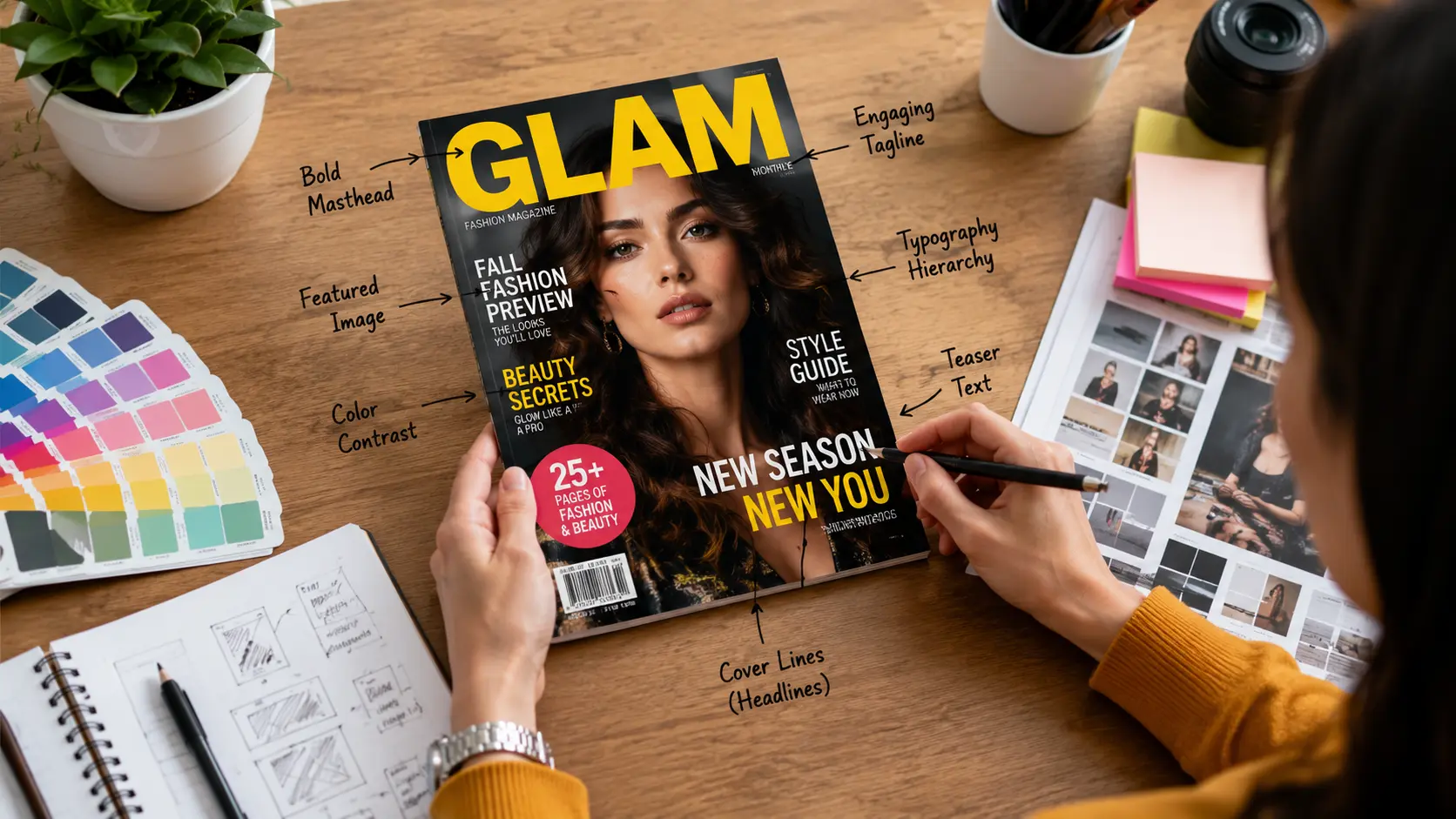
It is rare that people analyze the cover consciously, but their brains process various design cues simultaneously to create curiosity or indifference.
· Strong Branding Builds Familiarity
Experienced magazine cover designers know that consistency helps to build trust. A recognizable masthead, recurring visual style, and familiar layouts are those elements that help loyal readers to locate their favorite publication from several feet away.
· Headlines Promise Clear Value
The best cover lines should answer the audience: what is in it for me? Using specific promises, numbers, or exclusive stories often perform better because they communicate the readers’ benefit.
· Strategic White Space Improves Readability
Empty space does not mean that you are wasting it, but it separates the information, reduces visual stress, and makes headlines easy to notice from a distance.
· Images And Headlines Should Support Each Other
The photography and copy should tell the same story to complete the cover. You can use a dramatic image and pair it with a weak headline to create confusion so that the strong alignment reinforces the message of the magazine.
Steps to Create an Attention-Grabbing Magazine Cover
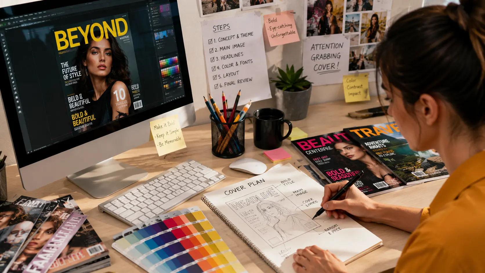
You need to plan carefully, not use guesswork, to create a memorable cover. Follow a structured process to make each visual component serve a clear purpose.
1. Define The Target Audience
Before you choose colors and images, you must need to know your audience. Different audiences respond uniquely to different visual styles, making audience research the foundation of an effective design.
2. Build A Clear Focal Point
You need one dominant element for each cover that can capture attention first. It can be an illustration, portrait, or bold headline, but anything else you use should support that centerpiece.
3. Balance Branding With Creativity
Most publishers often focus on best logo design services to ensure that their brand identity remains recognizable, which allows each issue to feel fresh and relevant.
4. Test Before Printing
Modern publishers often test various cover concepts through reader feedback, eye-tracking tools, or digital previews before final production. Studies are showing that adjusting layouts can significantly influence viewing patterns and recall.
5. Refine Every Small Detail
People who look for making a cool magazine cover focus on visuals only, but alignment, spacing, headline placement, and typography separate average covers from exceptional ones.
What Do Successful Magazine Covers Have in Common?
Each publication has its own personality, and most bestselling covers often follow surprisingly similar principles that can improve recognition and encourage purchases.
· Simplicity Beats Clutter
The inclusion of more headlines does not mean that it can create more value. The use of a strong cover can communicate one primary message before introducing supporting stories.
· Consistency Strengthens Brand Recognition
Familiarity often attracts readers, and they enjoy it. You should maintain recognizable colors, logo placement, and typography to reinforce brand identity across each monthly and weekly issue.
· Trends Are Used Carefully
People often search for how to make a cool magazine cover design to create modern layouts that feel fresh without sacrificing readability. Successful publishers do not redesign their entire visual identity each season, but often adopt selective design trends.
· Data Supports Creative Decisions
Publishers often use and pair up creative instincts with measurable audience insights. Research says that a thoughtful composition influences attention more effectively than adding extra visual elements alone.
Frequently Asked Questions
Why are some magazine covers different and stand apart from others?
Strongest covers often use a clear visual path that features bold imagery, readable typography, balanced spacing, and compelling headlines. It takes just seconds for readers to process these elements, which make a thoughtful design more effective instead of simply adding more graphics or text.
Is there any real effect of color on magazine sales?
Yes, color often influences emotion, attention, and brand recognition. Use of high-contrast combinations can improve visibility from a far distance, and consistent color palettes can help readers to identify familiar publications more quickly among competing magazines.
How crucial is the cover image instead of the headlines?
Cover image and headlines both work together. A striking image can grab the audience’s attention first, but the headline tells the reasons behind the issue that deserves attention. If the element of your cover feels weak or disconnected, the impact of the cover will be decreased significantly.
Final Verdict
You can make a successful magazine cover with the combination of branding, psychology, and thoughtful design into a single visual experience. Each color of your choice, photograph, headline, and font plays a significant role in how quickly readers notice a publication and decide whether it is worth picking up or not. Do not just chase flashy effects, but the strongest covers often focus on emotional connection, clarity, and consistent branding. Next time, when you walk past a newsstand, pause for a moment and ask your self that: which cover has caught your eye first and why?

I am a seasoned designer and content creator for Logo Design Ireland Blog, where I combine design expertise with actionable advice for business owners. My articles cover everything from logo trends and branding psychology to practical design tips that help Irish entrepreneurs elevate their brand identity.