
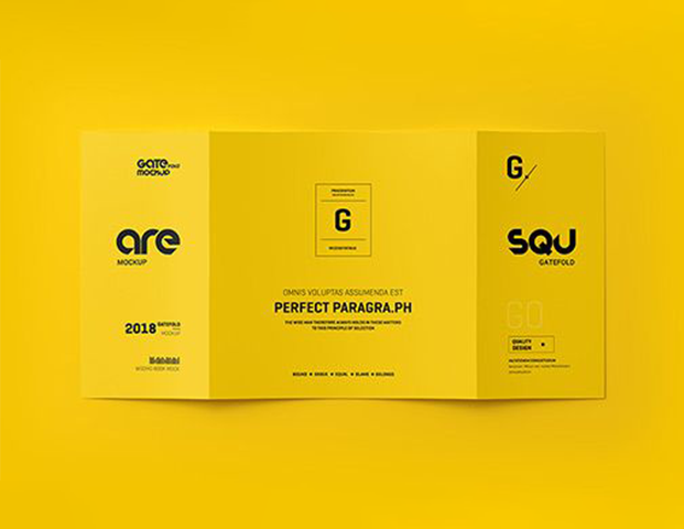
How a Well-Structured Brochure Communicates Brand Value Clearly
Table of Contents
A brochure is one of the few marketing materials that works entirely on its own. No algorithm, no ad spend, and no follow-up sequence. It is just a printed piece that represents your business in your absence.
That is exactly why the structure and design of a brochure carry more weight than most businesses realise. When a potential client picks one up, they are forming an opinion about how serious, reliable, and credible your business is. So, never think they are just reading about your services. The opinion forms quickly, well before they reach your contact details.
This article covers what makes a brochure communicate brand value clearly, from layout and visual hierarchy to how your logo ties everything together.
What makes a brochure look professional?
You have to keep in mind that structure always holds the key. A well-designed brochure isn’t the busiest one or the most detailed. It is the one where the reader always knows where to look next. That’s harder to achieve than it sounds.
Visual hierarchy does most of the work here. A strong headline at the top, key information in the middle, a clear next step at the end. When you break that order and don’t give each section the amount of attention it needs, the reader loses the thread. And once that happens, they stop reading.
White space is the other thing most businesses get wrong. The instinct is to fill every gap, especially when you’re paying for print. But crowded layouts are harder to read and tend to look cheaper, not richer. Giving the content room to breathe is one of the simplest things a designer does that makes an immediate difference.
Font and colour consistency matters too, though it’s easy to overlook. If your brochure uses different typefaces across sections or colours that don’t match your other materials, it creates a subtle disconnect. There is nothing dramatic about it. Just enough to make the brand feel slightly unfinished.
Why your logo matters more than you think
Before anyone reads a word in your brochure, they’ve already looked at your logo. That’s just how the eye works. It moves to the most recognisable element first. And in that split second, an impression is already forming.
A strong logo tells the reader the business is established, consistent, and worth paying attention to. A weak one pixelated, outdated, or just poorly designed does the opposite. It creates doubt before you’ve made your case.
This is why brochure design and logo design are really one decision, not two separate projects. The best brochure layout in the world won’t fully land if the logo sitting at the top of it looks like it was made in a hurry. They work together, or they work against each other. There is no middle ground.
If your logo hasn’t been updated in years or doesn’t appear consistently across your materials, that’s worth addressing before anything goes to print. Good company logo design Ireland starts with understanding what the brand needs to communicate and a brochure is one of the clearest tests of whether it’s doing that job.
Who most businesses can’t notice what is going wrong?
Most brochures don’t fail because of one obvious mistake. It’s usually a combination of small things like too much content, inconsistent fonts, or a logo that doesn’t quite match everything else. They all together or even individually can make the whole piece feel unpolished.
Too much content, too little clarity
When a brochure tries to cover everything, it ends up communicating nothing clearly. The businesses that get this right are usually the ones that made hard decisions about what to leave out not what to squeeze in.
Inconsistency across brand materials
A brochure printed last year, a website updated six months ago, or a logo that exists in three slightly different versions across your materials. If a client sees your brand for the first time and notices these inaccuracies, this inconsistency reads as disorganisation. Investing in professional brochure design in Ireland means getting all of that aligned.
No clear next step
A brochure without a call to action is just a catalogue. The reader finishes it, sets it down, and moves on. One clear instruction, a phone number, a website, or a prompt to get in touch is all it takes to turn interest into action.
These are fixable problems. They just need someone looking at the full picture rather than each piece in isolation.
How to choose a brochure or logo designer in Ireland
Choosing the right designer makes more of a difference than most people expect. They can make your make sure that everything looks good on your brochure design Ireland and also that the final result actually works for your business.
Look at their portfolio honestly
Not just whether their work looks good, but whether it looks varied. A designer who produces the same style for every client is applying a template to your brand, not thinking about it. You want someone whose portfolio shows they understand different businesses, not just different colours.
Ask how they approach the brief
A good designer asks questions before they open any software. What does your business do? Who are your clients? What do you want someone to feel when they see this? If the first thing they send you is a concept without asking anything, that’s a sign they’re designing for themselves, not for you.
Your brochure will likely end up in both print and digital formats handed out physically and shared as a PDF online. These aren’t the same thing. Colours behave differently in print, file sizes matter digitally, and layouts that work on paper don’t always translate to a screen. The best brochure design services in Ireland will handle both without you having to ask.
Don’t separate the brochure from the logo
If your logo needs to be edited, get it fixed before going for the brochure. A new brochure built around a weak or outdated logo will always feel slightly off, no matter how good the layout is. Many businesses in Ireland treat company logo design as a separate project, when really it’s the foundation for everything else.
Frequently Asked Questions
What should a professional brochure include?
A clear headline, a brief description of your services, and one direct call to action. Structure matters more than volume. A focused brochure will always outperform a packed one.
How important is logo design for a brochure?
Very. Your logo is processed before any text. If it looks inconsistent or outdated, it undermines everything else on the page. Company logo design in Ireland is worth getting right before anything goes to print.
How do I find a good brochure designer in Ireland?
Look for a varied portfolio and someone who asks about your business before presenting ideas. Experience across print and digital formats is worth checking most brochures end up in both.
Final Thoughts
A brochure works when everything behind it works. The structure, the layout, the logo, and the consistency across your materials. None of these is a standalone decision. They all feed into the same question: Does this brand look like one worth trusting?
We covered what makes a brochure look professional, why your logo carries more weight than most businesses give it credit for, what quietly goes wrong when brand materials don’t align, and what to look for when choosing the right designer. It all points to the same thing that intentional design is more about communicating properly rather than just looking impressive. Most businesses in Ireland already have the ingredients. A decent logo somewhere, a brochure that’s mostly right, materials that almost hang together. The gap between almost and actually is usually smaller than it looks. It just needs the right attention.

I am a seasoned designer and content creator for Logo Design Ireland Blog, where I combine design expertise with actionable advice for business owners. My articles cover everything from logo trends and branding psychology to practical design tips that help Irish entrepreneurs elevate their brand identity.