Guide To Making Eye-Catching Poster Designs
Table of Contents
Did you know that the human brain only takes 0.3 seconds to decide if something is worth paying attention to? Even blinking takes more time than this. This is the same amount of time you have to capture people’s attention with your posters.
Everyone is bombarded with ads and notifications all the time. In times like these, making posters isn’t just about conveying information. It’s about making people stop in their tracks, turn their heads around, and be awestruck. There’s more to the designing game than you think. Your work should stand out from the rest, make a bold statement.
It might seem a little scary to set yourself apart in tough competition, but it’s not impossible. All you need is the right strategies. In this blog, we’ll be guiding you through the process, so your posters make their presence felt.
The Art of Making Attractive Posters
Some tips and tricks work for all kinds of posters. Call these the pro hacks of designing. Knowing them is a must, especially if you’re new to this artistic game. Here is your all-in-one guide to making people stop in their tracks.

Who’s on the other side?
First things first, you need to know who your target audience is. Are they school-going children? Anime fans? Or is it college students? Your creative process won’t have a clear direction if you don’t know who you’re doing it for.
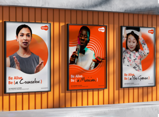
For younger people, there needs to be a lot of colors, funky fonts. On the other hand, custom posters Ireland for older audiences, especially professionals, will have toned-down shades and more serious fonts. It all depends on who you’re trying to attract.
Set a vision
This goes without saying, but you should have a clear goal in mind when you sit down to make a banner. Without setting a clear direction, you can’t make an impressive design; it’s like going on a road trip without a GPS, a map.
The result? You take all the wrong paths, waste a lot of time. So before you begin, ask yourself what you’re designing for. These are the usual purposes:
| Advertisement | Create hype around new product releases |
| Event promotion | Tell people about events like concerts, festivals, and community gatherings |
| Campaign marketing | Share information about different causes |
| Launching a sale | Promote discounts and create a sense of urgency. |
Less words, more impact
Here’s the thing: people don’t have the time to stand in front of posters and read them carefully. Your work shouldn’t have one long letter explaining the purpose. Make it short, don’t be too wordy. Banners are all about conveying the message visually as quickly as possible.

The fewer words your work has, the better. Just keep the important information, cut out everything else. Focus on the visual elements, make sure they do the talking, not the text.
What’s the mood?
Colors play an important role in evoking certain emotions in people. Red creates a sense of urgency; on the other hand, green is associated with nature and peace. The shades you use matter a lot. They will either make or break your artwork. Choose yours wisely.
For example, a poster for summer camp will have bright colors. Designs for corporate events will use dull, neutral shades.
Let the design breathe.
You may have a hundred different ideas and think.
“Oh, I want to add everything to my layout.”
But this can backfire badly. Here’s the thing: you can’t overcrowd your poster. It’ll only look messy. There needs to be enough free space so that all your visual elements are easily visible. You want people’s eyes to widen with amazement, not squint in confusion.
Have some fun
Enough talk about rules. Don’t forget, banner design isn’t defined by any strict rules. You’re also supposed to have fun during the process. It’s good to experiment as long as your poster doesn’t look messy.

Let your creativity run wild. If there’s one thing people love, its designs that are nothing like the rest.
Make it talk
Think of a banner in which you have to look for the important information. Let’s say it’s about a concert, and the venue details are nowhere to be seen. You look around until you see it squeezed into the corner, in the smallest font size possible.
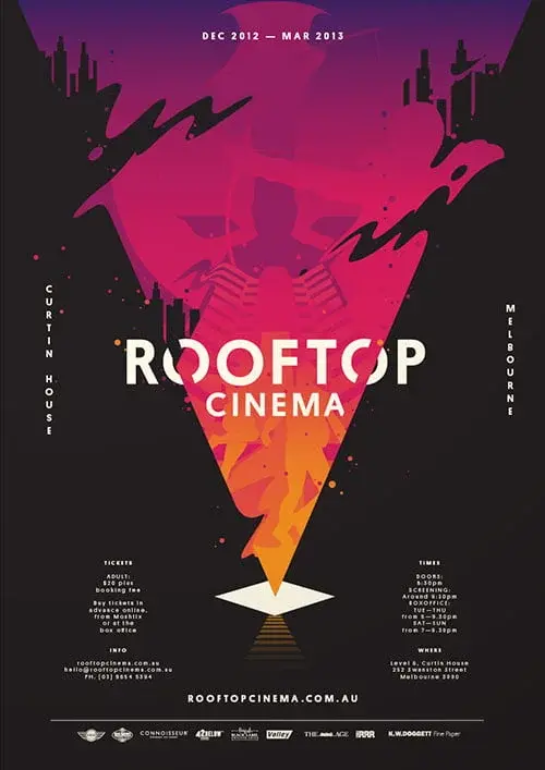
This is an example of a poorly designed poster. You don’t want to make the same mistake. Use visual hierarchy to highlight the important details. The brand name and logo design Cork should be the most visible.
People Also Ask
- Is a CTA important?
Absolutely! Especially if you’re trying to urge people to buy your product or attend your event. A clear call to action is a must.
- Is there a set limit for the text?
Not really, but keep it as minimal as possible. Your poster should do the talking, not the text. People only spend a few seconds scanning banners. Make sure you get the message across as quickly as possible.
- What software should I use?
The most popular design tools are Adobe Illustrator, Photoshop, InDesign, and Canva. Choose one that fits your needs best.
Wrapping Up
Having to grab people’s attention in a matter literal 0.3 seconds sounds like a challenge, and it is one. This is all the time you get before attentions are diverted. Your design can either disappear into the background like all the other boring posters or rise above them all. Use this as a chance to get your message across.
You don’t have to be a professional to make good posters. We all start from somewhere, so it’s okay if you’re a beginner. All you need are smart strategies. These aren’t just little hacks or insider tips; they’re tools that help you cut through the visual noise. There’s no doubt the competition is tough; everyone wants to grab their audience’s attention. But don’t let this scare you into thinking your designs can’t be great. Remember, every great poster starts from a small screen and big ideas.
I am a seasoned designer and content creator for Logo Design Ireland Blog, where I combine design expertise with actionable advice for business owners. My articles cover everything from logo trends and branding psychology to practical design tips that help Irish entrepreneurs elevate their brand identity.

