Stand Out With Your Business Card Design
Table of Contents
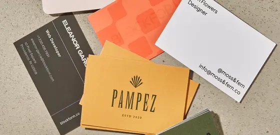
Most business cards aren’t attractive enough to stand out. In fact, they blend in with all the others. They all look the same, a small logo in the corner and a line of contact details. Most have the old-fashioned layout squeezed into the standard-sized rectangle. It’s almost as if all they follow a formula, nothing more, nothing less. The result? They are all tossed away and forgotten.
Your card doesn’t have to share the same fate.
In today’s professional world, the first impression is what matters the most. Your card decides whether someone will remember or forget you after you meet them for the first time. A well-designed one doesn’t just convey your contact details. It reflects your personality, professionalism, and dedication.
Think of them as conversation starters, the beginning of long-lasting connections. Of course, you wouldn’t want the first introduction to be underwhelming, would you? This is why having an attractive design is important. Don’t settle for the usual ones; they’re easily forgotten.
Creating a good image with these little rectangles doesn’t have to be so difficult. Here’s how you can make the most of yours.
Business Cards That Do More Than Just Networking
Making a company card that stands out from the crowd isn’t the easiest task, especially if you’re new to designing. But don’t worry. We all start from somewhere. Follow these steps to make yours an attractive one.

First things first
This goes without saying, but the first step is to decide on a shape and size for the card. Will it be vertical? Or Horizontal?
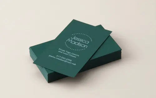
Ask yourself how much information you’re going to include in it. The usual size for a business card Ireland is 3.5 x 2 inches. Go for a vertical layout if you’re a fan of standing out.
Branding elements
One thing you can’t overlook while making the cards is your visual identity. Keep every detail in mind, like colors, fonts, and logo. Confused? Here’s a little breakdown to help you.
- Colors
Use the ones in your brand, choose a maximum of 3. Make sure the shades are contrasting; it’ll make the text more visible. Keep the background simple, or else the layout will be overwhelming.
- Fonts
Don’t use more than two fonts. One for your name and one for your contact details. Choose the ones that align with your brand. Here’s a little breakdown to help you
| Font Type | Used for | Example |
| Serif | Contact details | Times New Roman Garamond Georgia |
| Sans-serif | Business name | Helvetica Arial Geneva |
| Script | Tagline and decorative text | Pacifica Great Vibes Allura |
- Logo Placement
Place your logo somewhere it can be seen easily. Use high resolution so the image quality isn’t damaged when the card is printed. Leave enough free space, don’t overcrowd the layout.

What is it saying?
Now comes the main question:
“What information should be included in the card?”
Here are the details you should add
| Your name | Use your full name |
| Job title | Keep it clear and simple |
| Company title | Add it for credibility |
| Email address | Use a professional one, not the funny one you made as a teenager |
| Contact number | Provide one that’s always active |
| Website | Make it easier to find out more about you |
Visual Hierarchy
The most important information should be the most visible. Your name and company title should be the most prominent. Next up should be your email address and phone number.
Anyone who gets your company card shouldn’t have to look for the information they need. It should be right there, easily readable.
Choose the right cardstock.
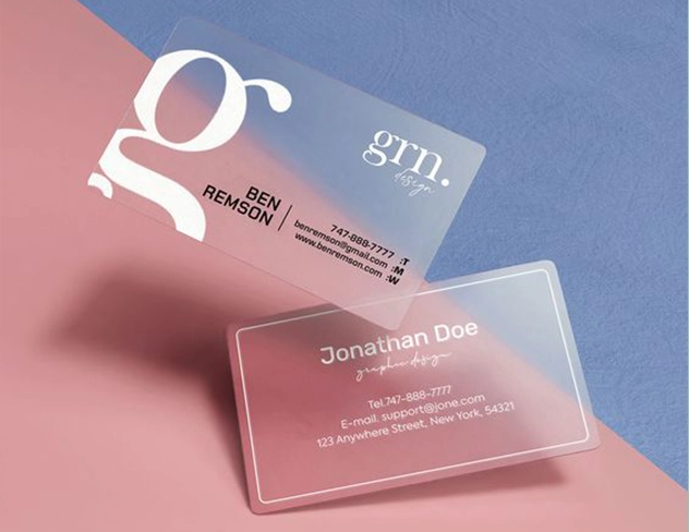
The power doesn’t just lie in the design when it comes to business cards. They are physical tools for networking, so yours should look and feel good when they’re held.
Here’s a table to make the choice easier for you
| Standard Matte | Gives a smooth and professional look |
| Glossy | Has a shiny finishSuitable for vibrant colors |
| Linen | Textured feel Gives off an elegant and sophisticated look |
| Kraft | Eco-friendly cardsGood for environment-conscious brands |
| Soft touch | Velvety feelGreat for premium services |
Last but not least
Now that you’re done with all the steps, it’s time for the final one: getting the card made.
Follow these steps to turn your visions into reality.
- Look for an agency
You can hire a freelancer or a professional service for this.
- Ask for samples
Judge if their previous work matches your expectations, especially if you’re looking for the best logo design services too.
- Compare pricing
Go for affordable pricing, but don’t compromise on the quality in exchange for cheap services.
- Reviews
Check client testimonials online, double-check them for authenticity. Many services have fake reviews, so keep an eye out.
People Also Ask
- Should I use a photo of myself?
A photo will be useful if you have a personal brand, but it’s not necessary. Prioritize brand identity over visuals.
- Are QR codes useful?
Of course! QR codes are the easiest way for people to get to your website, portfolio. Your card will do more than just provide your contact information in this way.
- Is whitespace necessary?
Absolutely, it makes sure your layout is readable and doesn’t overwhelm the overall layout. Don’t overcrowd it. Clean layouts are the best.
Final Thought
Your business cards are more than just small paper rectangles. They’re a reflection of who you are as a professional, the value you bring. Most cards fade into the background, tossed away.
Yours will not be forgotten, all you have to do is design it the right way. A generic layout with the same old layout might provide your contact information, but it won’t tell an inspiring story about you. So pay close attention to each detail.
When you have a carefully created layout, it becomes more than just a networking tool. It shows will show that you care about how you appear, and that you are worth being remembered. Make your card something to talk about, something to connect over. Let your creativity shine through. Don’t forget the professional world is all about first impressions. So make yours count.
I am a seasoned designer and content creator for Logo Design Ireland Blog, where I combine design expertise with actionable advice for business owners. My articles cover everything from logo trends and branding psychology to practical design tips that help Irish entrepreneurs elevate their brand identity.

