Five Minimalist Website Design Strategies That Work
Table of Contents
A website is everything for a business, because it is often the first impression your customer has of you. It’s important to have it right because it can drive more sales by impressing your audience. However, most of the time, websites are overloaded with content, and the layout is just so off that it confuses your audience. That can’t drastically reduce the traffic on your site.
Knowing that all you need is a simple but well-designed website. It will give a professional look and will surely convert your audience into loyal customers.
Isn’t that what you want? Keep reading the blog because it is packed with simple website design ideas that may seem basic but can become a game-changer for your small business.
How to Make Your Website Both Simple and Effective
If you really want to make it effective, you have to combine simplicity with smart design choices. Imagine you go to a website, and even browsing is complicated. A tricky layout, an inconsistent experience, and all the related blunders can put off your audience. You don’t need a flashy website; you just need a simple yet effective design because that works wonders.
To get the job done, hiring a reputable web design agency Ireland is the easiest route. However, if you want to be independent, you must understand the fundamentals.
In short, a simply designed website is all you need to convert your visitors. Here are five effective design ideas that can help your business thrive:
1. Keep Your Layout Clean and Focused
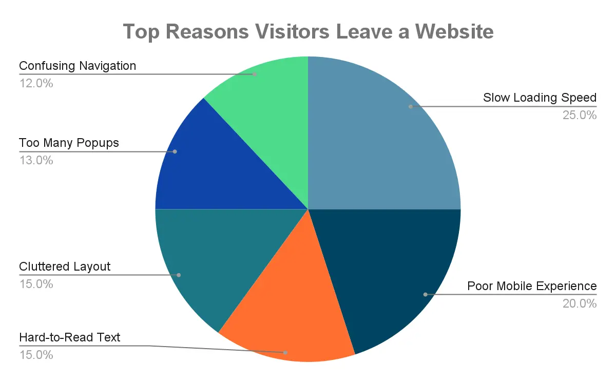
Nobody wants to go to a website that seems like a maze. You wander around, but it is just too confusing to find anything. Since a cluttered website only confuses people, keeping your layout minimalistic will do more than good.
You must use the white space wisely so the content on the website is absorbed better. This will also make your content easier to scan and aesthetically appealing.
Overcrowding your web pages with too many images, text, or widgets distracts your audience and prevents them from reaching the checkout cart for your product or service. It’s ideal to keep the layout organised so your visitors browse your site effortlessly.
2. Use Simple and Clear Navigation
If your website’s navigation is right, your audience will know exactly where to go on your site. Whether it is about learning more about your product/service, reading your story, or contacting your team to place an order, they should know where to perform that action.
Try to keep your menu short and crisp to avoid any inconvenience. People might find it difficult to understand categories when there are way too many. By keeping only the essential pages in the main menu, you can make their browsing experience easier.
Any website with too many links all across the page can be complicated. Avoid complex dropdowns, and also name the page logically so people get what it’s about instantly.
Wondering why it is needed? When your navigation is simple, your visitors will stay longer and browse more on your site. The more they stay, the higher the chances of making a purchase. So, it is a win-win situation for you.
3. Choose Readable and Simple Fonts
Want your audience to have a seamless experience? Factor in typography! When your fonts are clean and less stylised, people will instantly understand what you’re trying to communicate. If they have to strain their eyes to understand what’s on the site, you’ve already lost the battle of getting engagement.
You must ensure that the text is large enough to be read comfortably on all devices. By keeping reasonable space between the lines and adding contrast to the text and background, the readability increases.
To make your message visible to everyone, especially on mobile devices, stick to one or two fonts throughout the page. Too many fonts can not only create confusion but also portray you as unprofessional.
4. Stick to a Consistent Colour Palette
If you want your site to look professional and less busy, try sticking to a consistent colour palette. Choose colours that complement each other and are not jarring to the eyes. For a cohesive look, choose two or three primary colours that are relevant to your business logo design or brand identity. Whether on buttons or headings, only the colour should reign throughout your site.
Colour can have a positive impact on the visitor. For instance, when you maintain a strong contrast in the call-to-action button with black-on-yellow text, it will stand out more than usual.
Basically, your website colours should work together instead of having a clash. Only if they work well with each other will they attract the audience.
5. Focus on Mobile-Friendly Design
Having a mobile-friendly website is no longer an option, because almost 90% of the site traffic is via mobile. Once you have a responsive design, your site will automatically adjust to the different screen sizes. When this adjustment is seamless, the content will be easier to read, and navigation will be smoother than ever.
Anything that is too much on your face, including large images or elements, is a big no-no. Make sure your buttons, menus, and links are easy to tap and spaced nicely for comfortable viewing.
By doing it, you can satisfy a larger audience and strengthen your online presence.

Frequently Asked Questions
- How often should I update my small business website?
It’s always a good idea to update your website every few months. This way, your site will feel fresh and accurate to customers. Eventually, you will create a solid reputation online.
- Do I need professional photos for a simple website design?
It’s definitely not mandatory, but professional photos can make your website look more polished and credible. Always use stock-free images that are high definition to leave a solid impression.
- What pages are essential for a small business website?
Stick to the basics like a homepage, About, Service or Product, Contact, and Order Now pages. These are the core pages that get the job done. Minimum pages means less clutter and easy browsing.
Wrapping Up
With that being said, a simple website is no longer a barrier but is an effective strategy to keep it appealing and attract more customers. Try to keep a clean layout, simple fonts, consistent colours, and a mobile-friendly design, and make your website deliver tangible results. Just by following these simple strategies, your customer conversion rate skyrockets, leaving you with countless loyal clients.
I am a seasoned designer and content creator for Logo Design Ireland Blog, where I combine design expertise with actionable advice for business owners. My articles cover everything from logo trends and branding psychology to practical design tips that help Irish entrepreneurs elevate their brand identity.

